
A few days ago, on this blog, I noted the “big jump” in the number of articles in the #HR specialist press and elsewhere about the number of employment tribunal claims/cases, all featuring an eye-catching but totally rubbish theory by some law firm trying to drum up business from employers.
It’s an old trick, and I’m sure last week’s dire examples won’t be the last. So, having finally worked out how to change obscure settings on my Mac to enable me to access the monthly ET statistics as well as the quarterly ones – some time ago, the Ministry of Injustice changed the operating system used to publish the statistics, and the new system is not Mac user-friendly – I’ve decided to populate this post with up-to-date charts of the monthly number of ET claims in each jurisdiction. Then, if someone approaches you with a fishy story about an ‘explosion’ or ‘surge’ of claims in any one jurisdiction, you can quickly check it out here. You’re welcome.
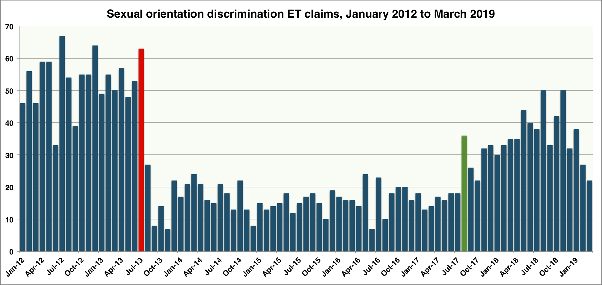
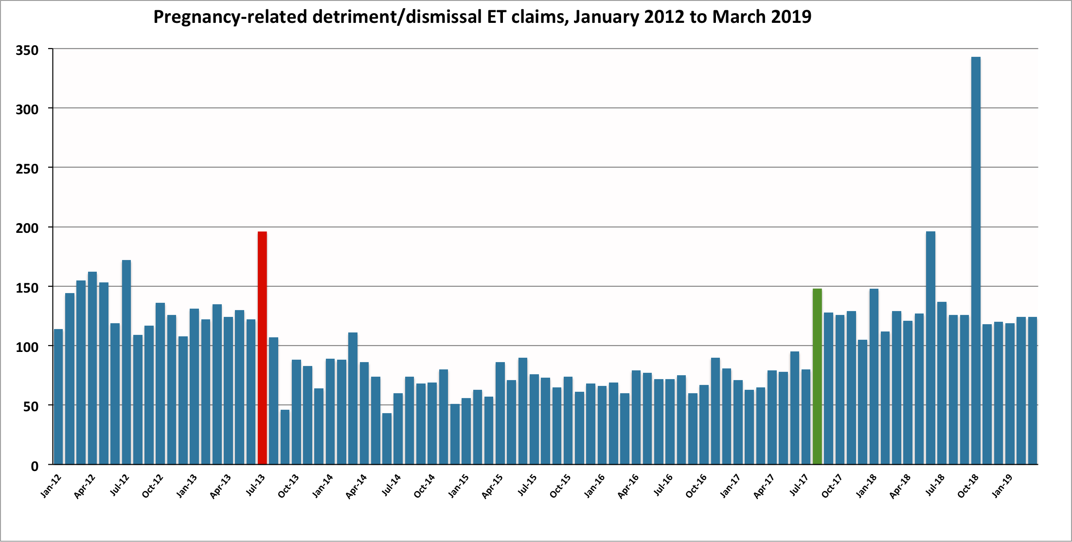
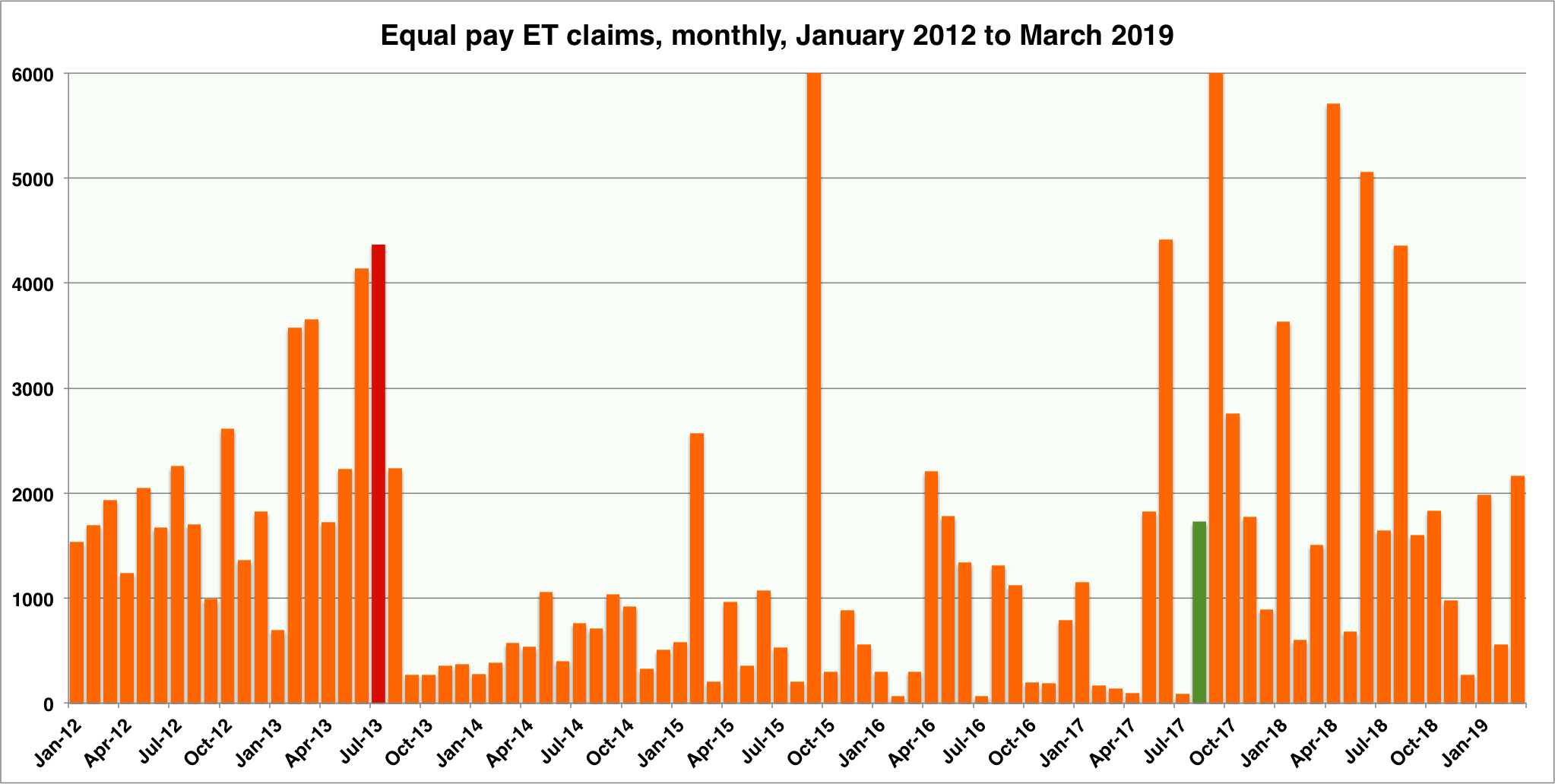
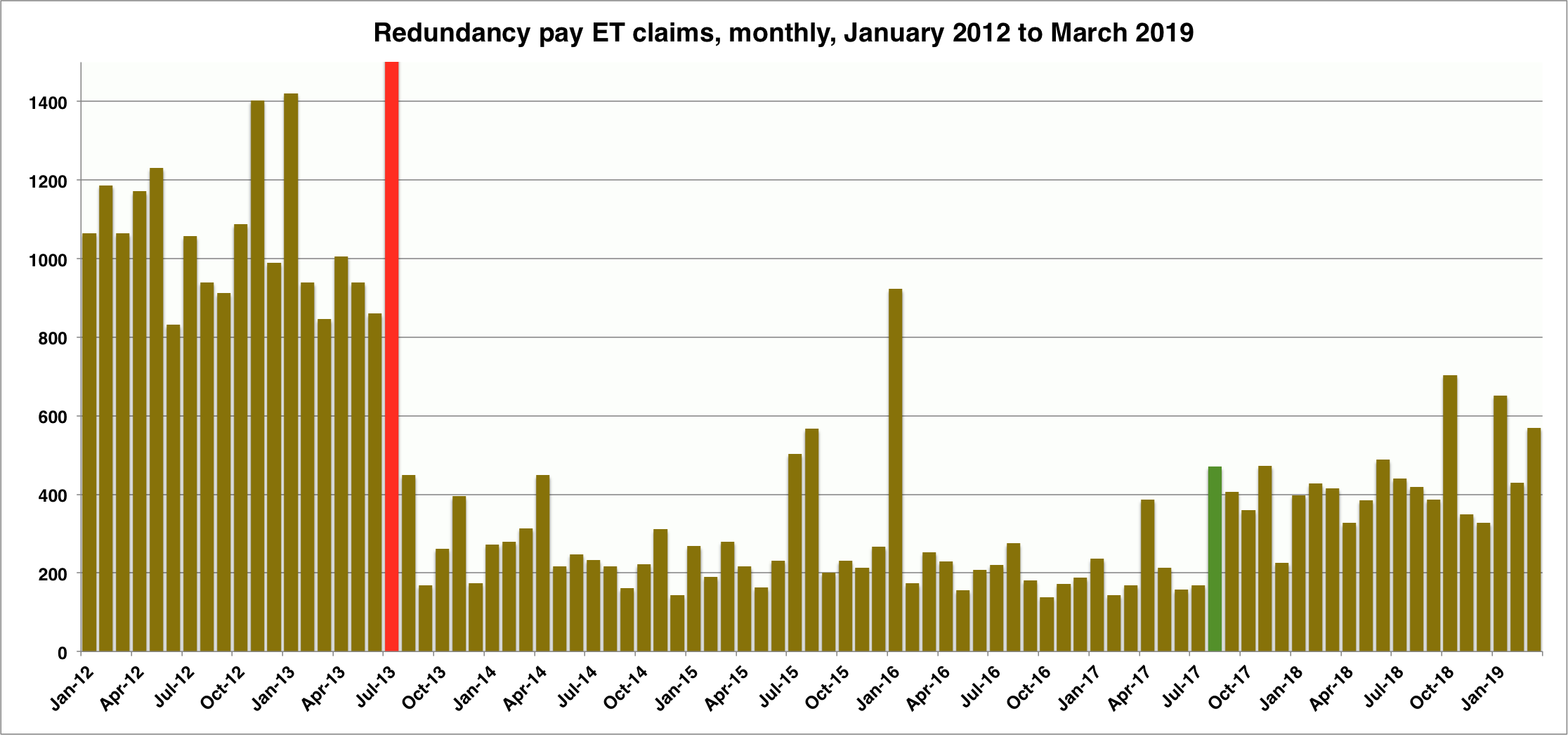
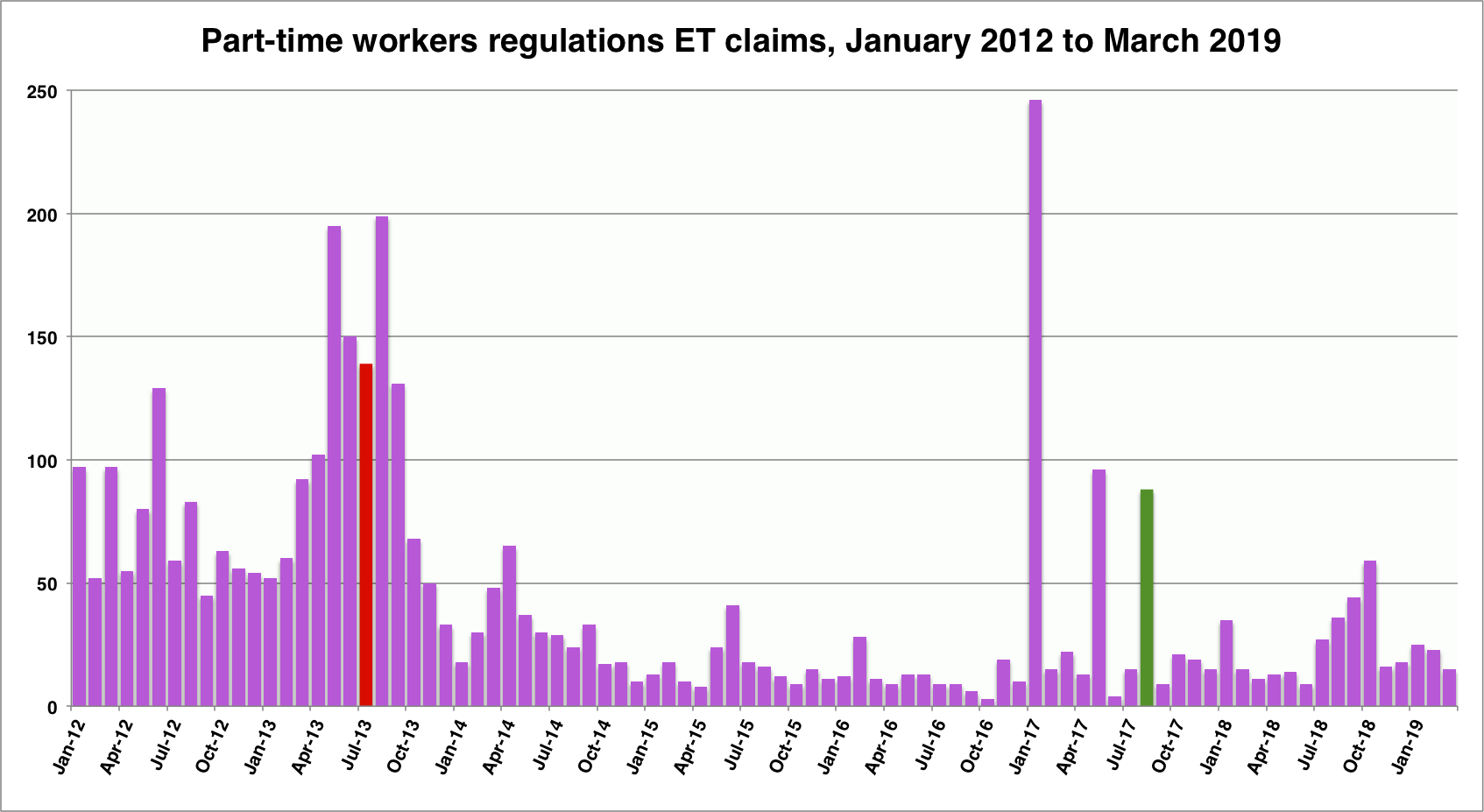
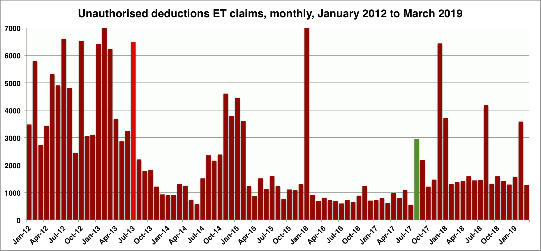
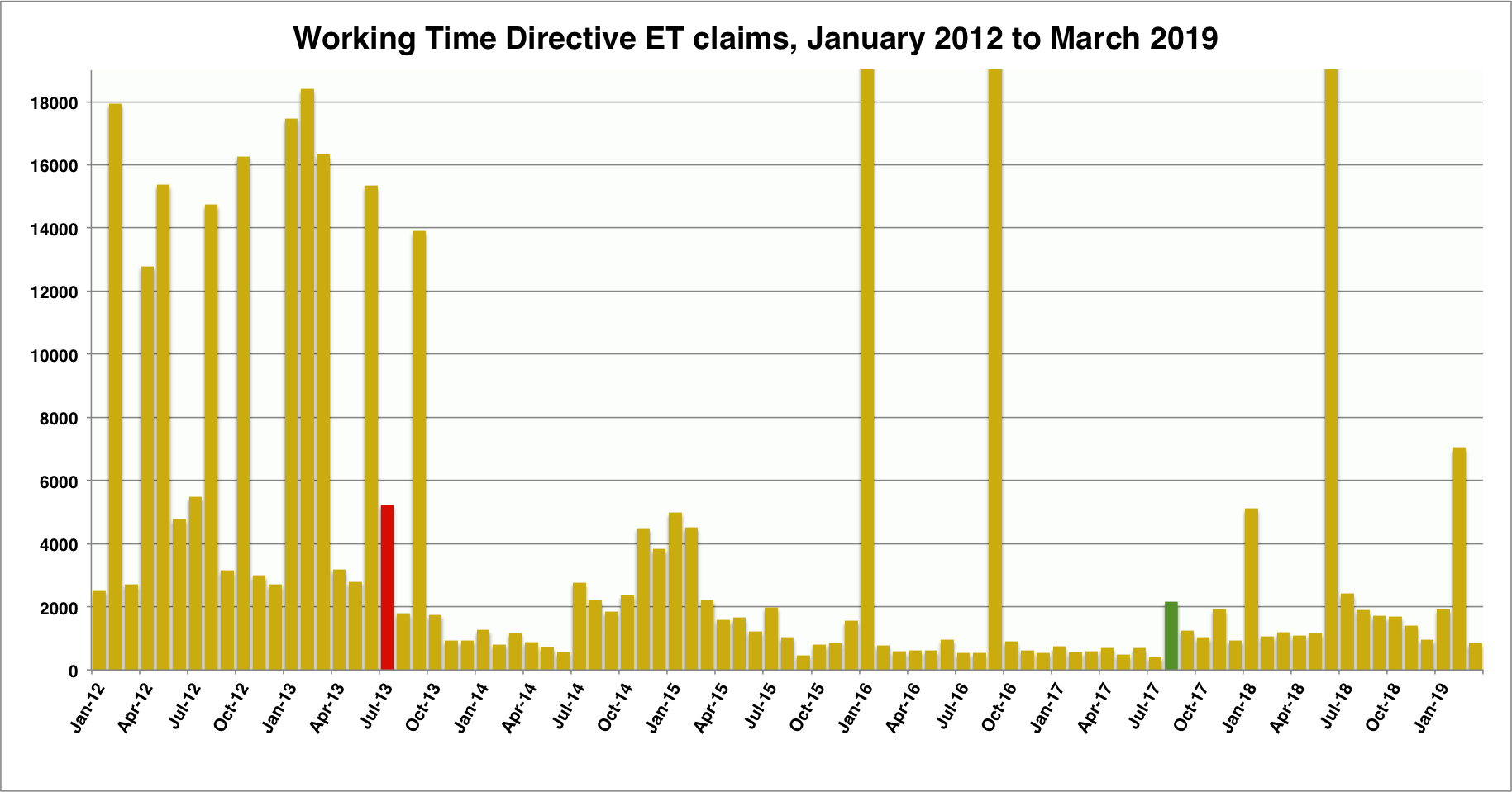
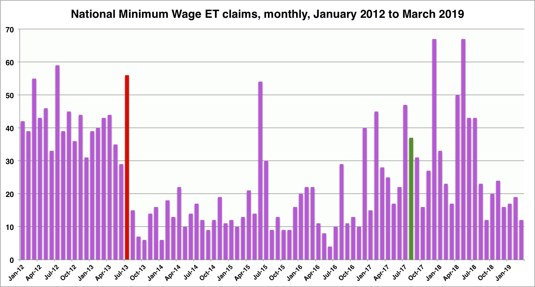
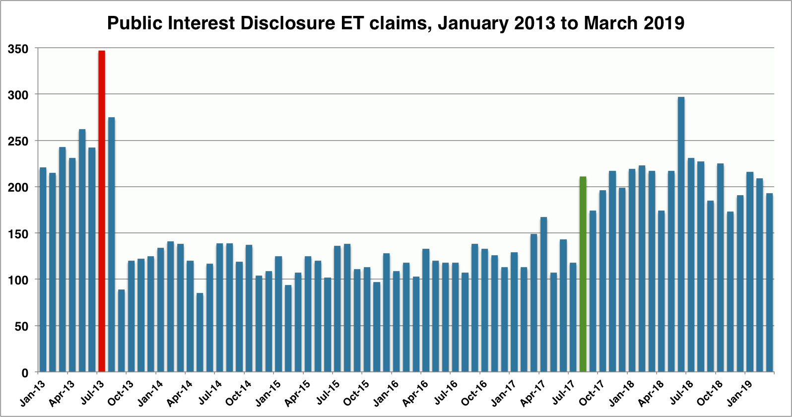
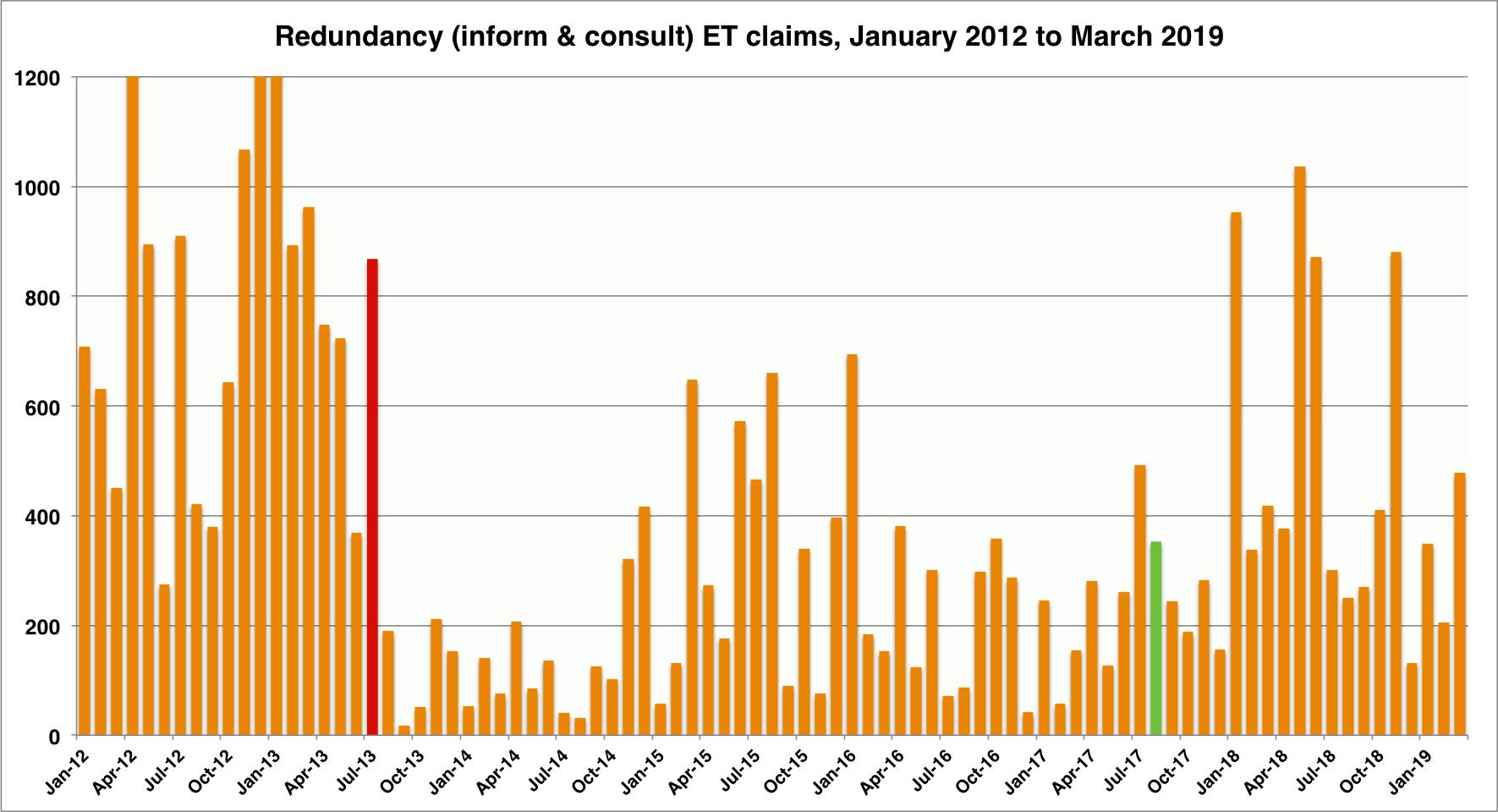
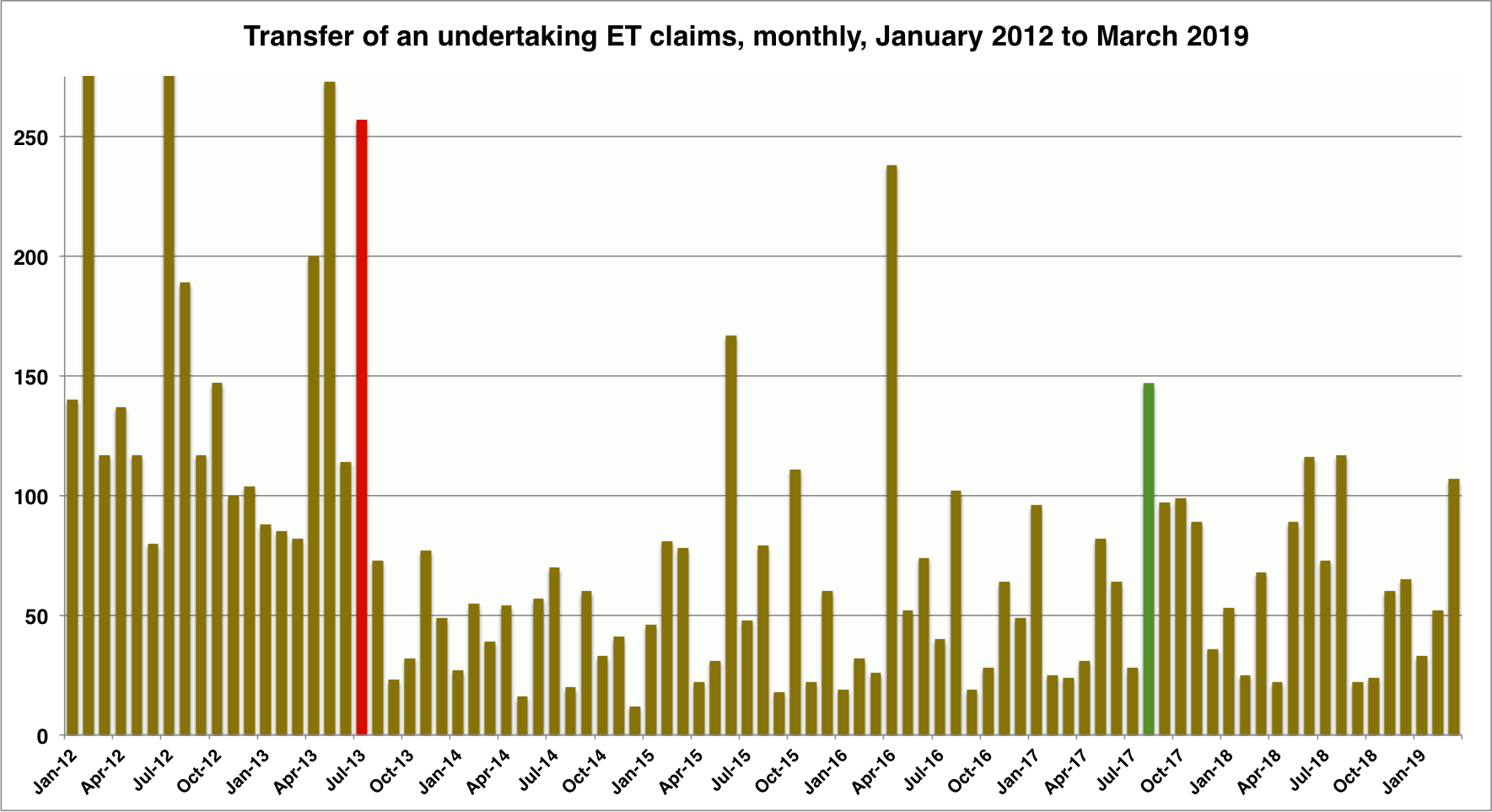
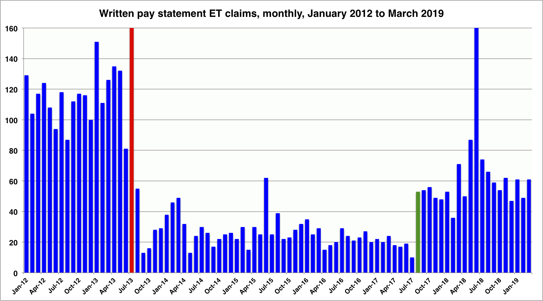
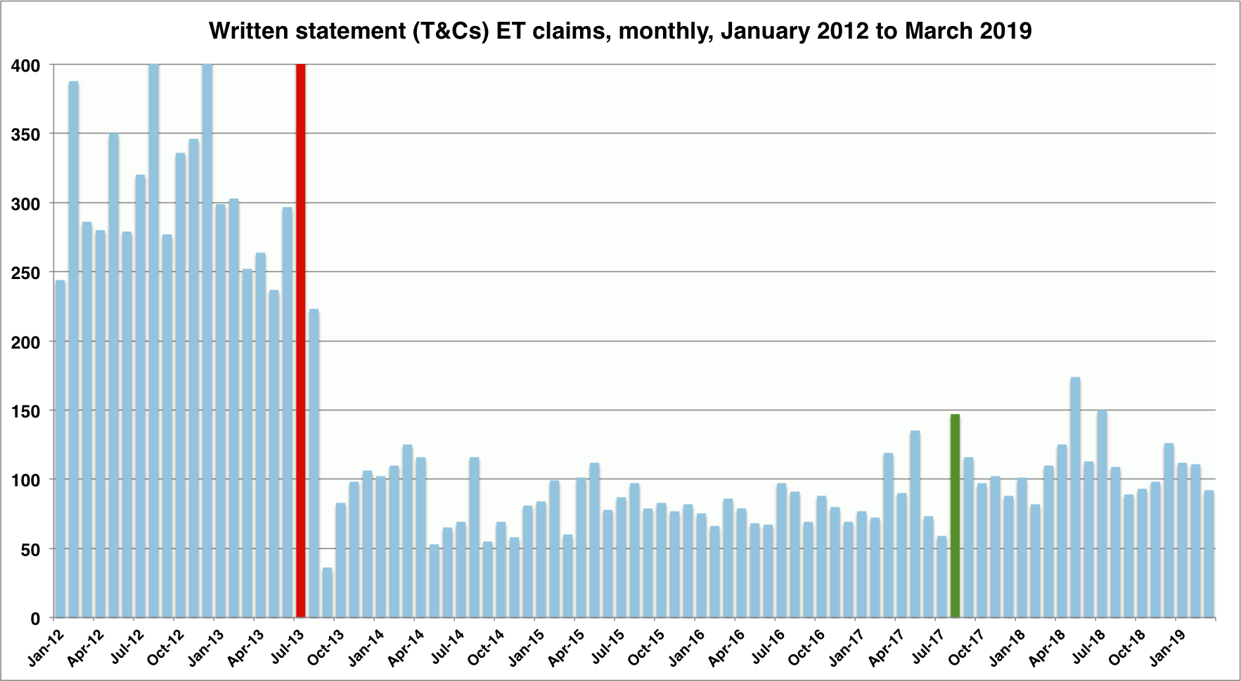
In each chart, the red bar marks the introduction of ET fees, in July 2013, and the green bar marks the abolition of those fees, in July 2017. Note that, where a bar goes off the scale, that is usually because it is way off the scale (these jurisdictional charts include all the claims in multiple claimant cases, remember). And, if the law firm (or their PR) is pitching you a story based on a comparison between a period wholly or partly between the red and green bars, and a period to the right of the green bar, then it is bollox. Because all the comparison will be showing is the impact of the abolition of ET fees in July 2017.
Any assertion of a current and significant increase in claims in any one jurisdiction needs to be supported by a comparison between two separate periods (each at least six months long) to the right of the green bar – that is, two periods subsequent to July 2017. Indeed, they should be subsequent to September or even December 2017, as in many jurisdictions it took several months for the impact of the abolition of fees to be fully realised.
I will update each chart every three months, as the latest set of quarterly statistics is published. And I will (probably) get better at formatting the charts to make them more consistent in appearance. Please feel free to use them any way you see fit. Because we can only have a proper debate about access to justice in the workplace if that debate is informed by evidence, not by silly headlines and proxy advertising in media outlets.
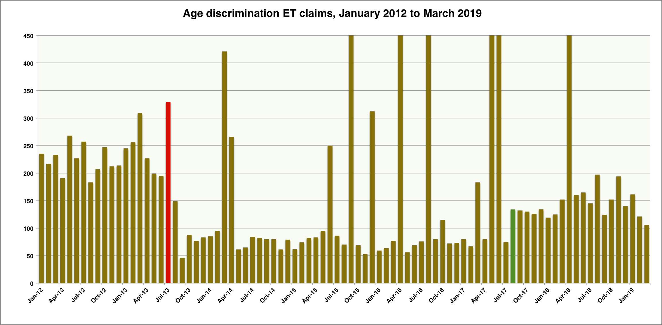

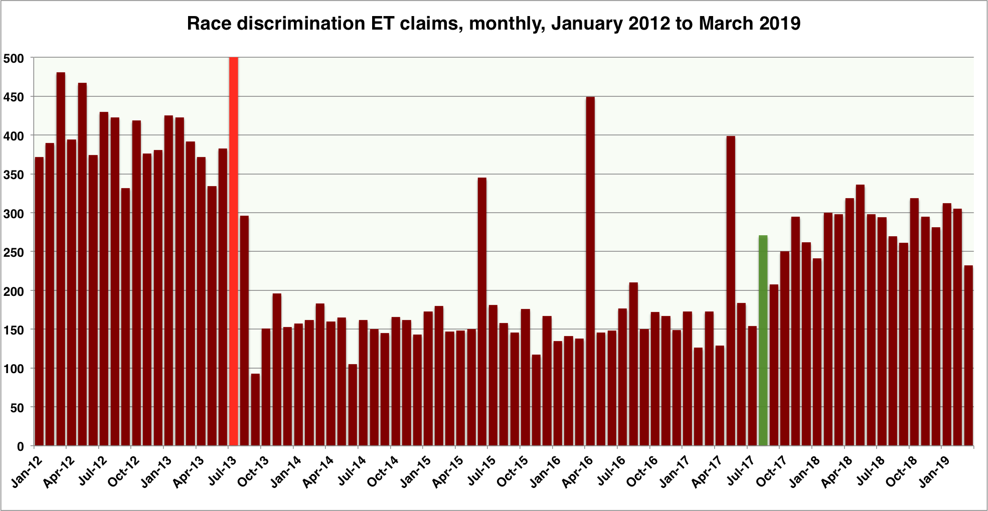
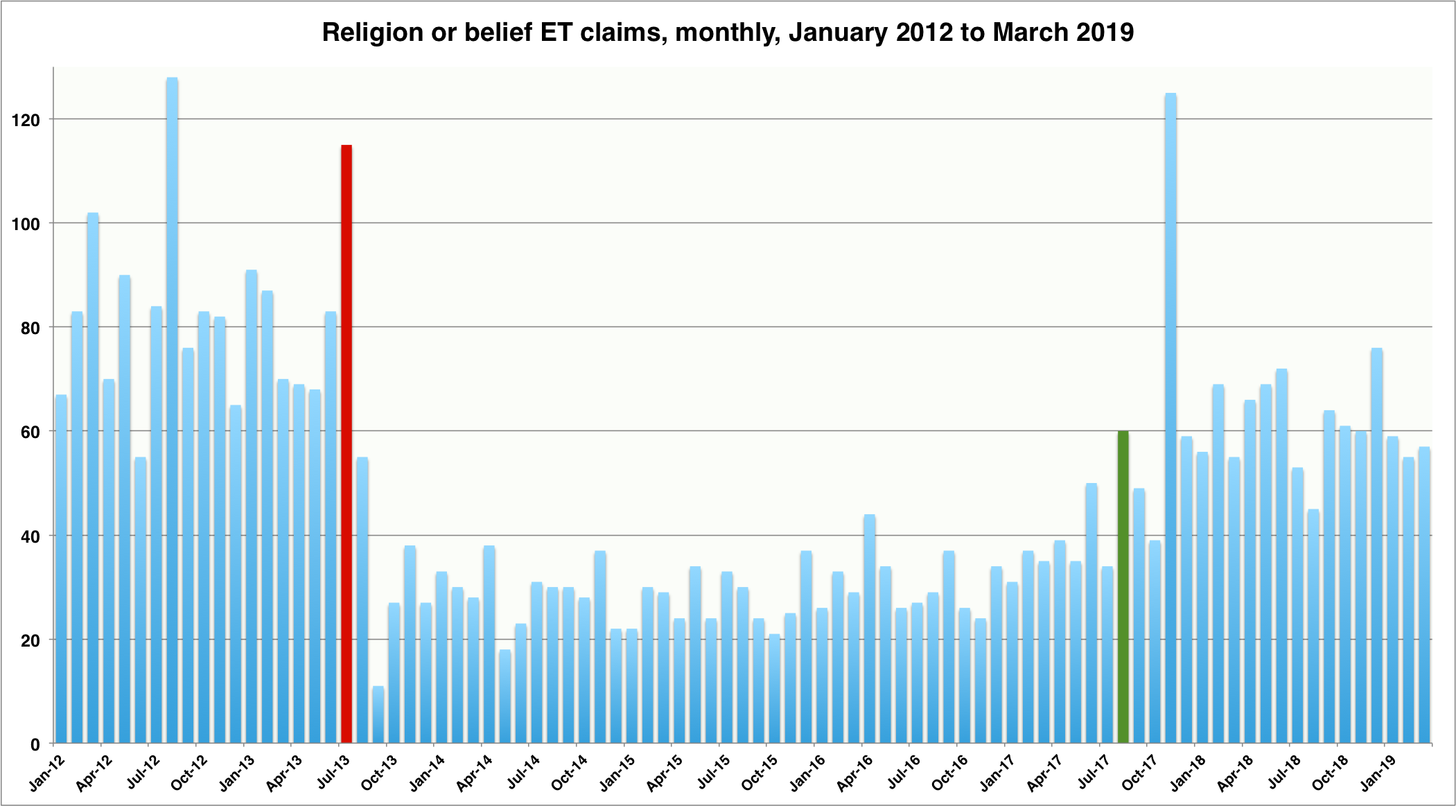
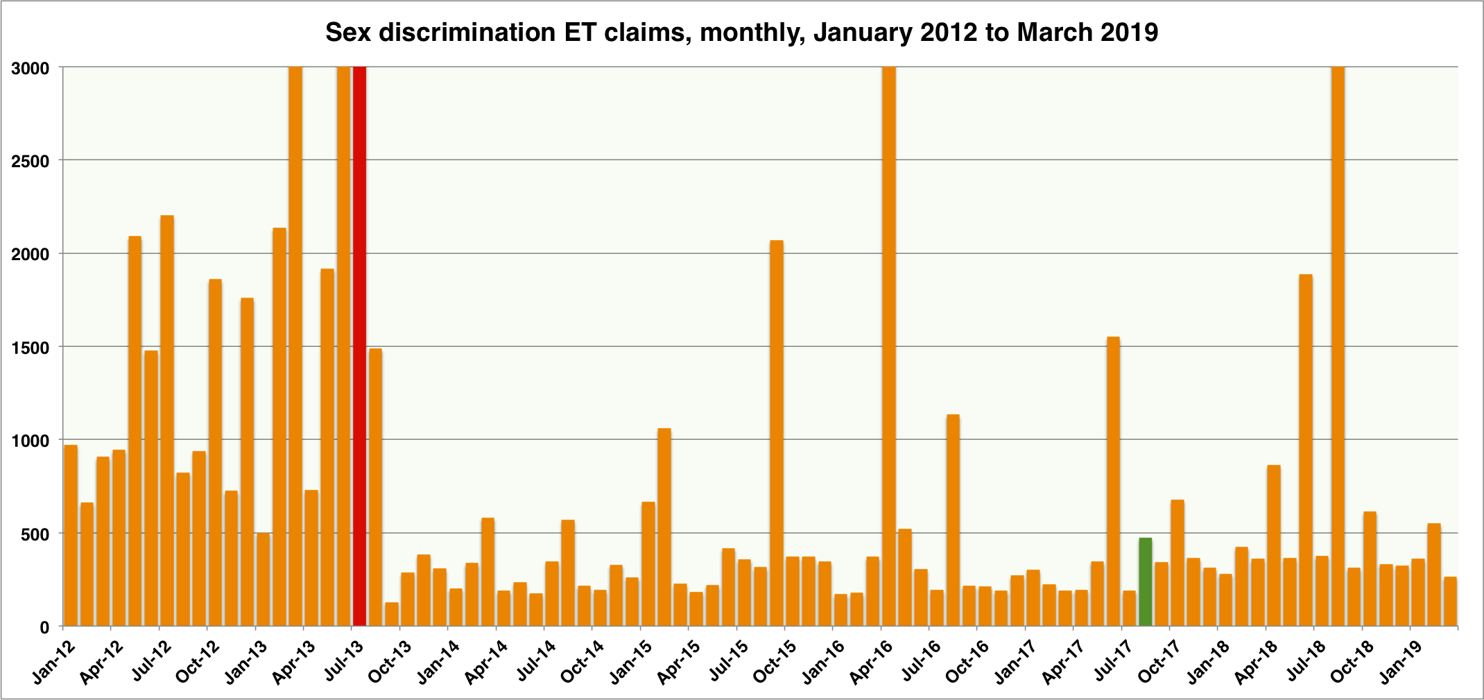
The next chart shows the sum of all discrimination-related claims (i.e. age, disability, race, religion/belief, sex, sexual orientation and pregnancy detriment). From this, we can see that Britain is becoming a fairer country. Or something.

And just look at the number of unfair dismissal claims exploding!

But – whoa! – is this a ‘growth industry’? Someone tell GQ Littler! They could get a piece in The Times on the back of this.
Don’t ask me what’s going on with WTD claims. Ask Sean Jones, or someone like that.


Pingback: Continuing increase in employment tribunal claims in first quarter of 2019